Stelier
Growing a custom luxury furniture brand
UX/UI • Shopify • eCommerce

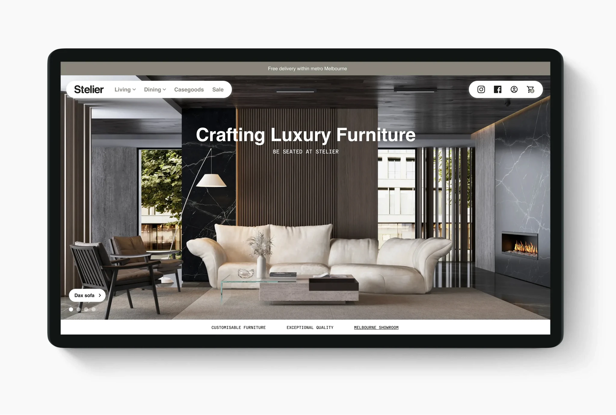
Stelier is a new luxury furniture brand entering a competitive market, seeking to establish a strong online presence that conveys a sense of modern luxury while accommodating the realities of being a small business just getting started. By diving right into the design process, I was able to balance the need for a high-end look with a budget-conscious approach that supported Stelier's unique brand identity.
Client
Stelier
Contributions
UX design, UI design, Project & Client Management
Year
2024
Stelier
Growing a custom luxury furniture brand
UX/UI • Shopify • eCommerce

Stelier is a new luxury furniture brand entering a competitive market, seeking to establish a strong online presence that conveys a sense of modern luxury while accommodating the realities of being a small business just getting started. By diving right into the design process, I was able to balance the need for a high-end look with a budget-conscious approach that supported Stelier's unique brand identity.
Client
Stelier
Contributions
UX design, UI design, Project & Client Management
Year
2024
Stelier
Growing a custom luxury furniture brand
UX/UI • Shopify • eCommerce

Stelier is a new luxury furniture brand entering a competitive market, seeking to establish a strong online presence that conveys a sense of modern luxury while accommodating the realities of being a small business just getting started. By diving right into the design process, I was able to balance the need for a high-end look with a budget-conscious approach that supported Stelier's unique brand identity.
Client
Stelier
Contributions
UX design, UI design, Project & Client Management
Year
2024
Stelier
Growing a custom luxury furniture brand
UX/UI • Shopify • eCommerce

Stelier is a new luxury furniture brand entering a competitive market, seeking to establish a strong online presence that conveys a sense of modern luxury while accommodating the realities of being a small business just getting started. By diving right into the design process, I was able to balance the need for a high-end look with a budget-conscious approach that supported Stelier's unique brand identity.
Client
Stelier
Contributions
UX design, UI design, Project & Client Management
Year
2024


Problems & goals
Establishing a luxury online presence for a growing brand on a budget
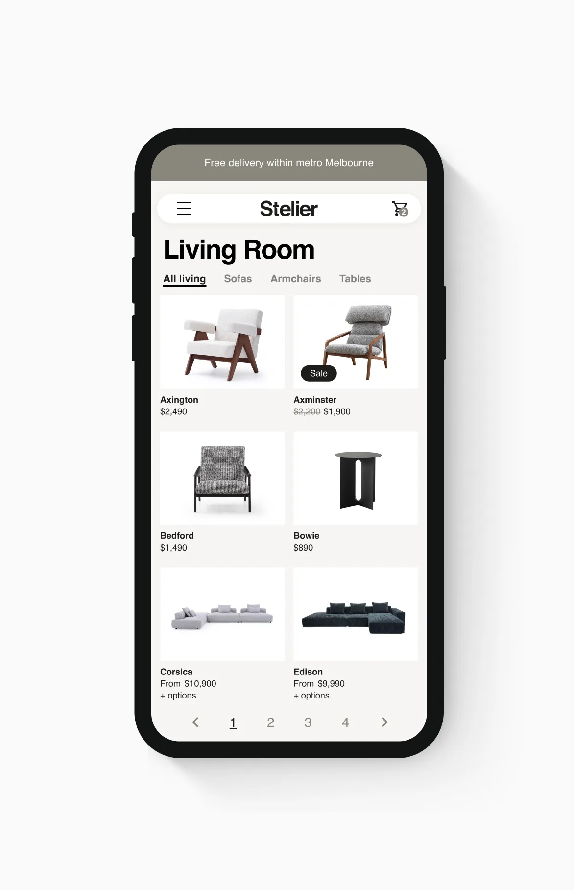
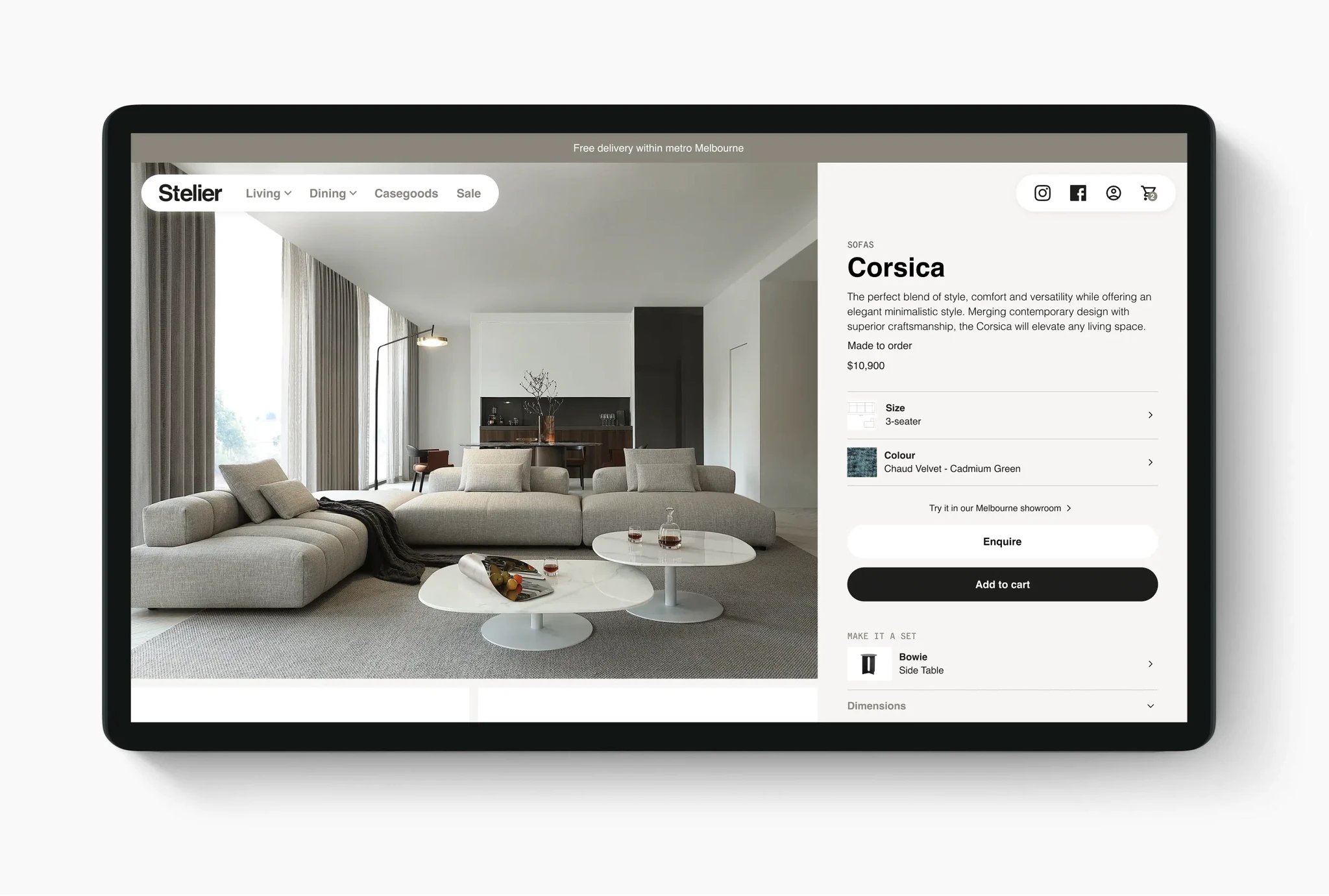
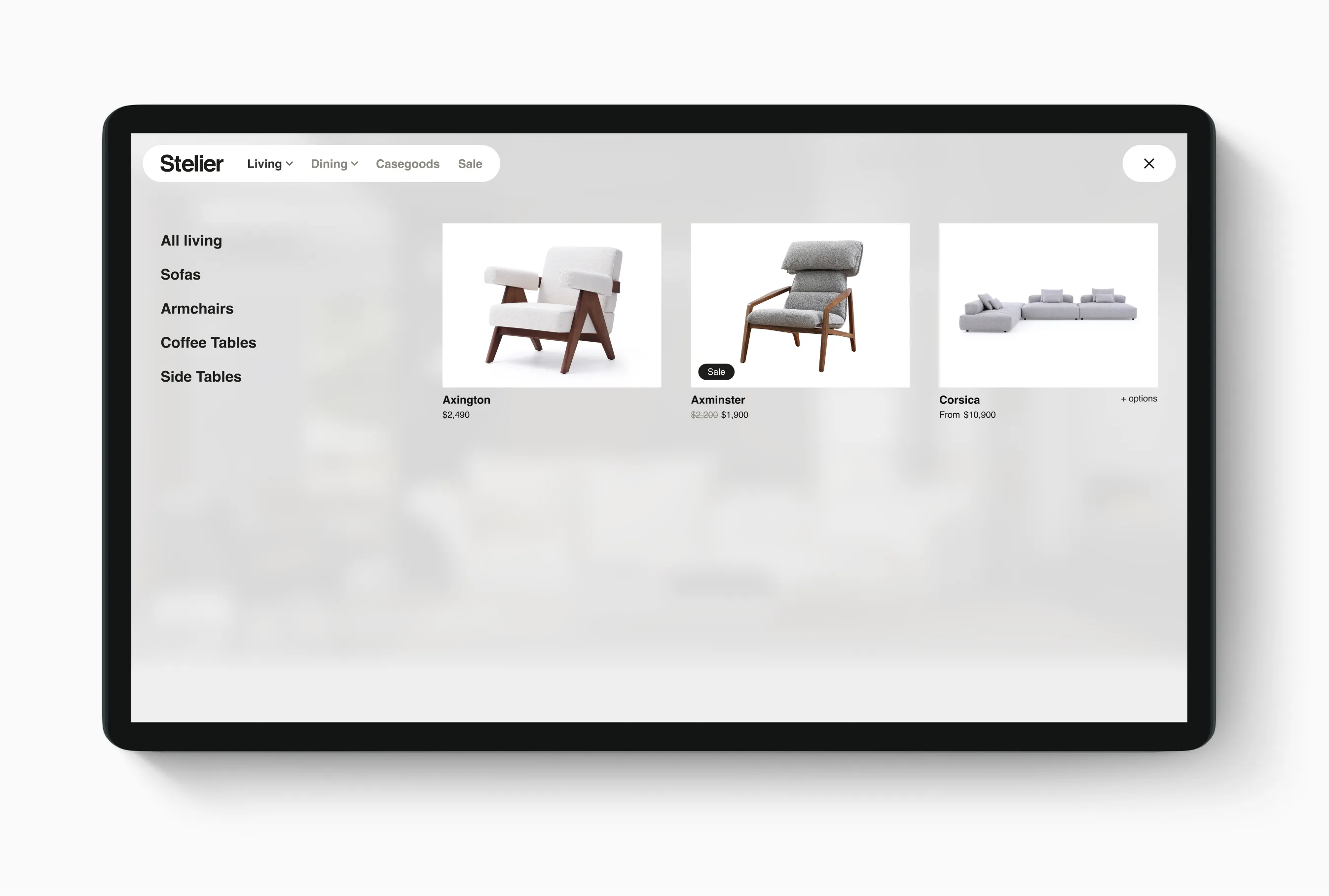
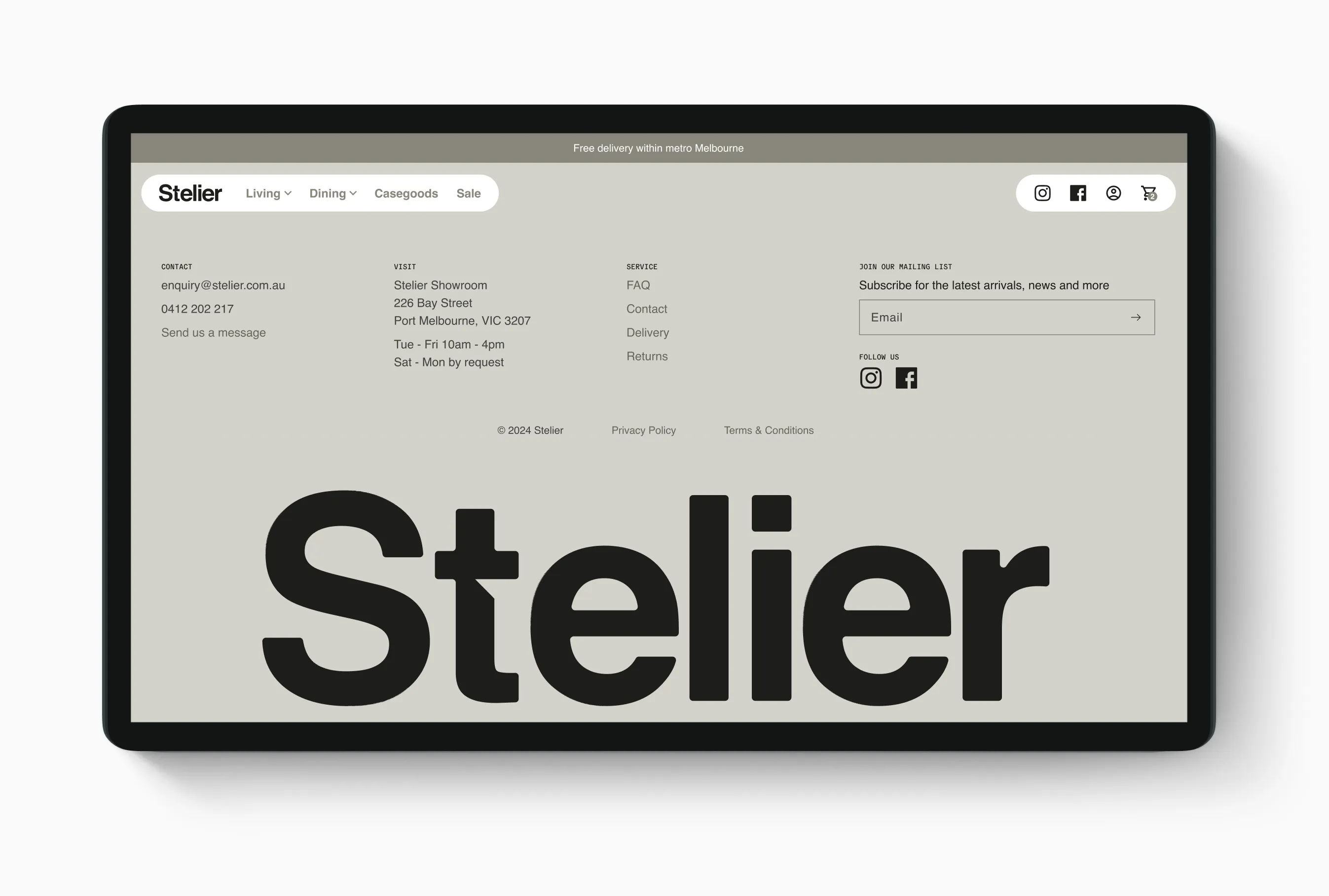
Stelier faced the challenge of needing to make a strong impact in the luxury furniture market with a limited budget. Working with a developer colleague our goal was to research and recommend the right platform and create a refined but starter site. We ultimately chose Shopify for its customisation abilities, customer support, and robust features. The eCommerce site needed to not only showcase their products beautifully but also provide room for the business to grow as their offerings and resources expanded.
Getting started
Wireframes and Competitor Analysis: Visualising User Flow and Content Structure
To inform the wireframes, I did competitor analysis of luxury brands like Poliform and Jardan, as well as mid-tier brands like Koala and Eva, to identify common patterns in information structures. This helped establish the core content and templates needed for the MVP, aligning the design with user expectations for a luxury experience. I created wireframes to define the MVP, focusing on essential user journeys to ensure a smooth experience. These wireframes helped align the stakeholders and developer on the project direction.

Product details
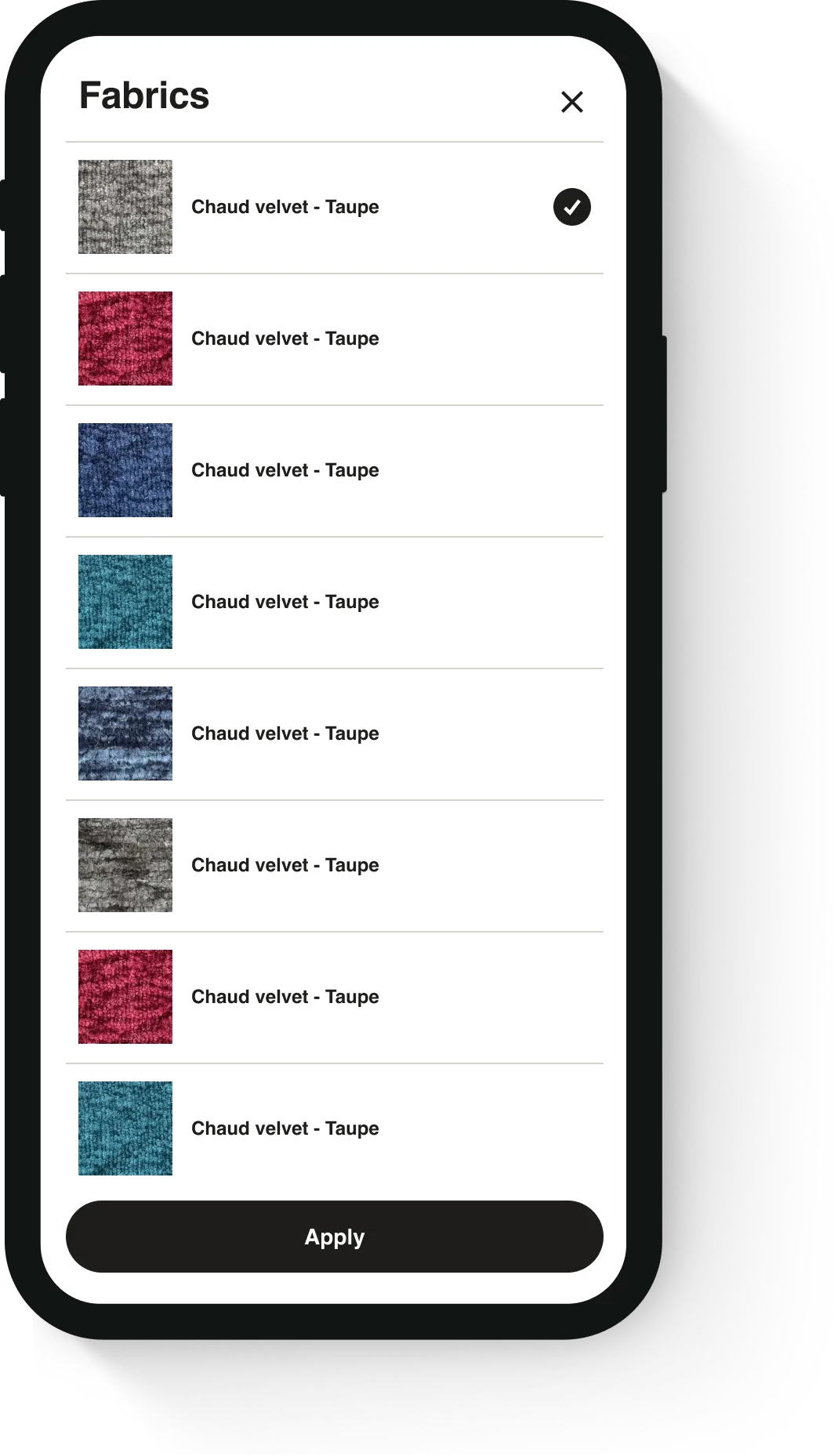
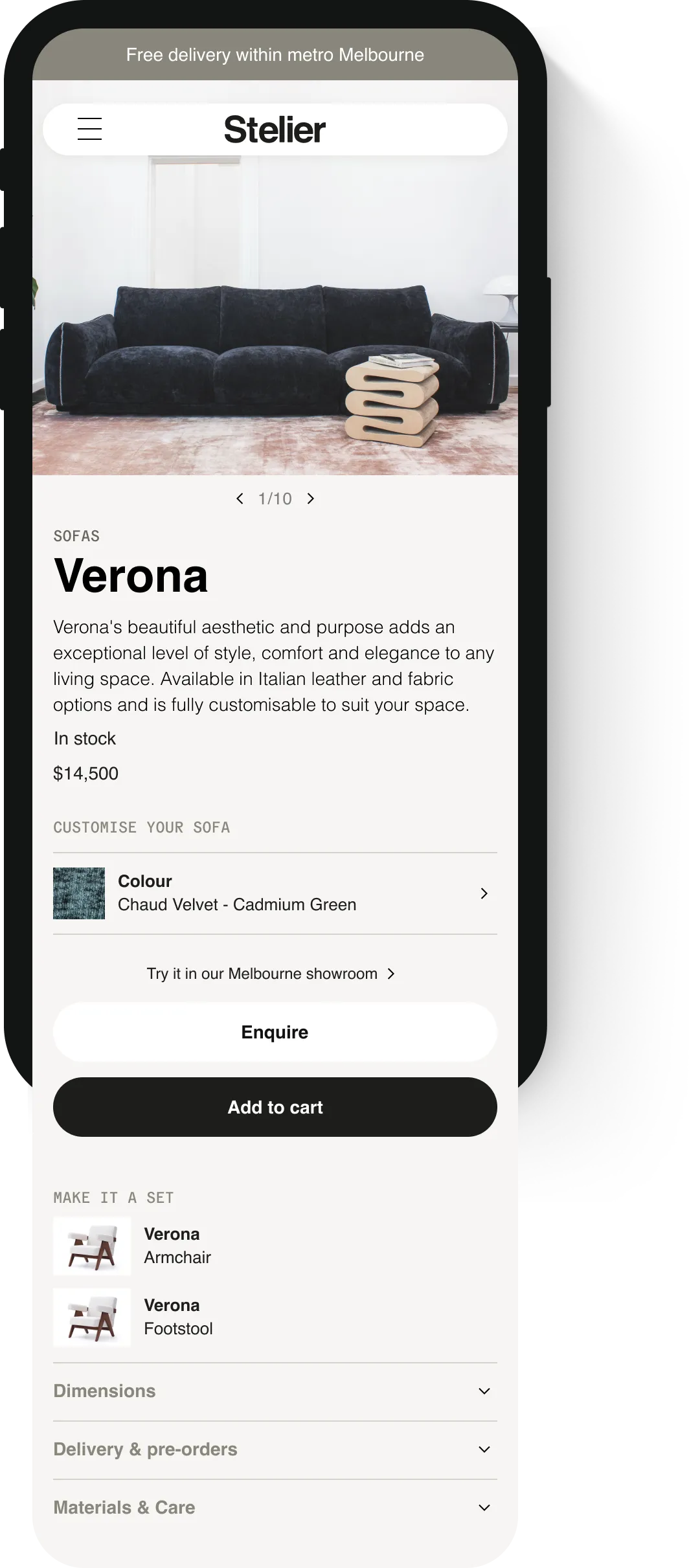
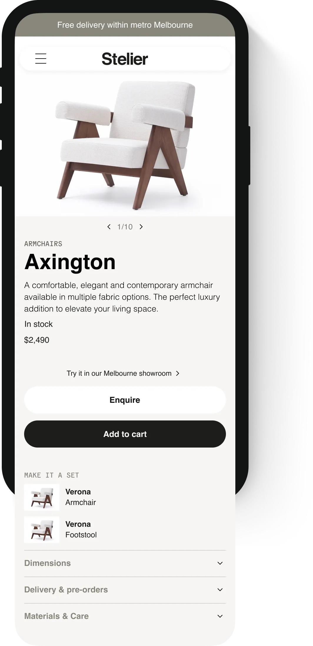
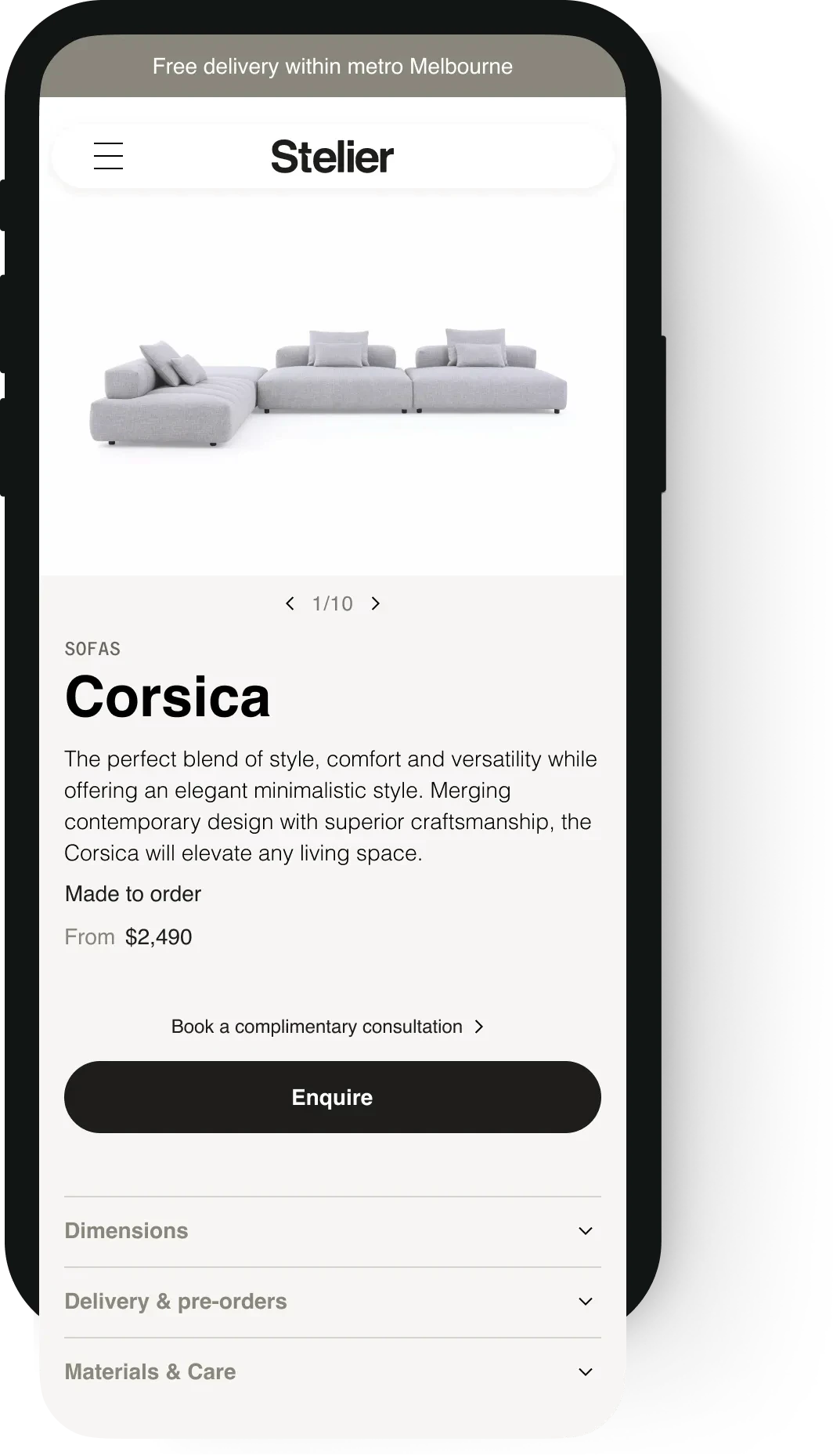
Variables for made to order, in stock and customisable product options
The product details needed to accommodate options for items Stelier had in the showroom and those made to order. Some products were fully customisable where the products needed a consultation to make an order, some had fixed custom options like fabric and size and others had no custom options. So I had to design a flexible product page and work with the developer to ensure Shopify could adapt to these variables.
Full custom options

Size modal

Fabrics modal
Fabric options only
No custom options
Made to order
Card iterations
Refining design to reduce Stelier's workload
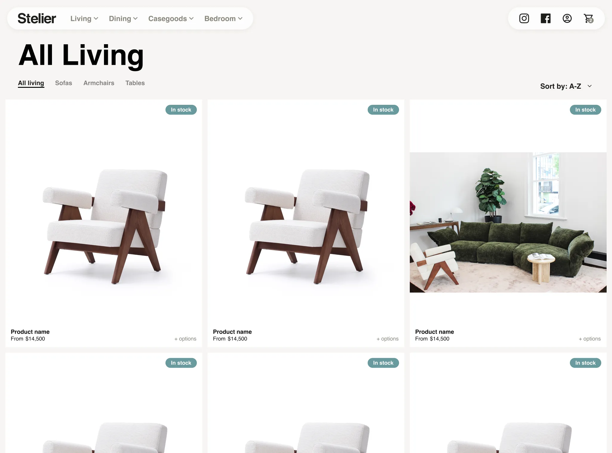
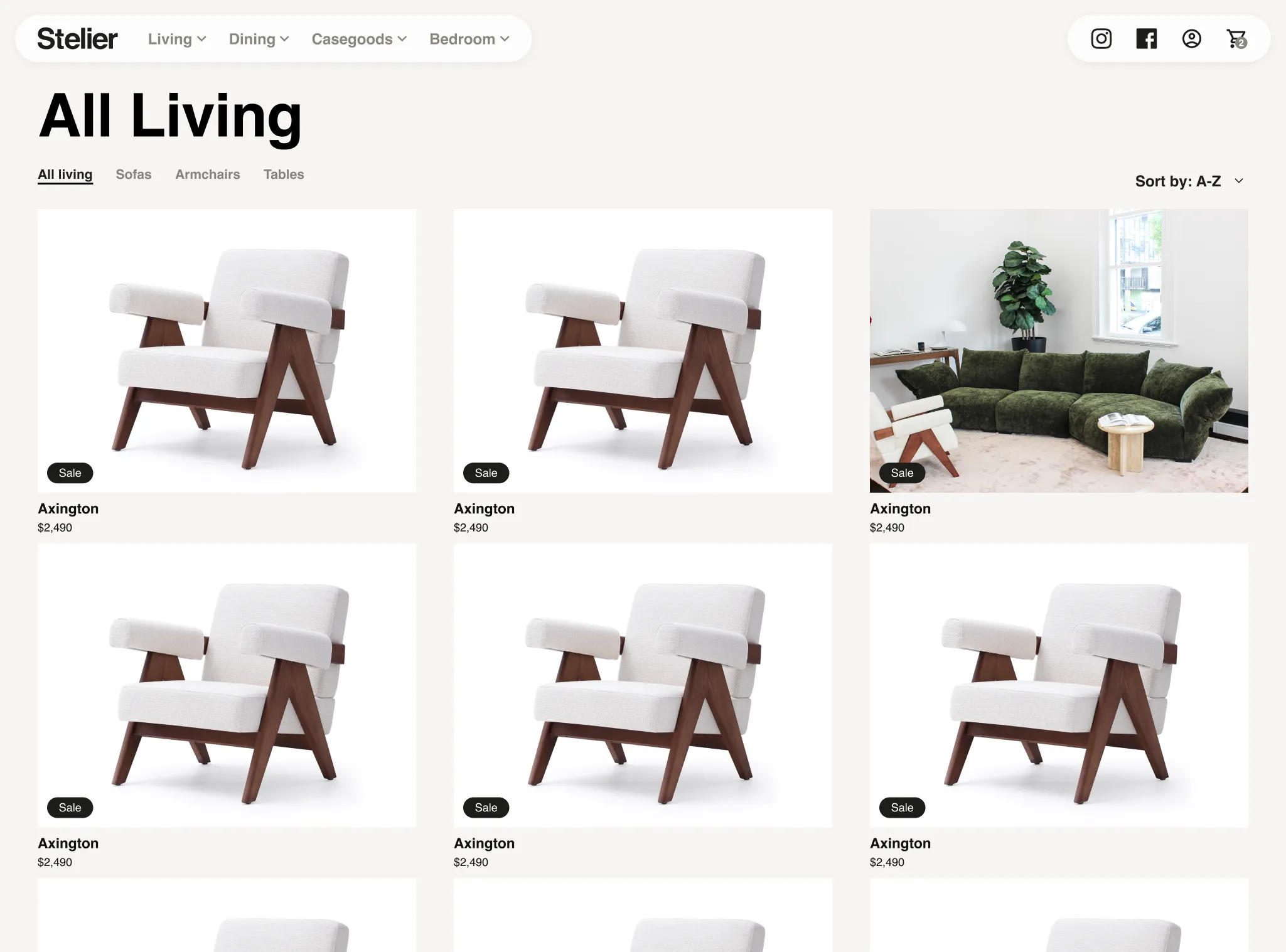
Initially, the product photography was expected to be high-resolution images on a white background, allowing for a more refined product card design. However, as Stelier began working with their suppliers, it became clear that images varied significantly in size, ratio, and style. Stelier didn't have the time or expertise to manually edit each image, so we came up with a solution that could accommodate varied photography, automatically cropping and fitting each image to the card.
First iteration
More custom and refined design, but issues with non-compliant images or varied sizes and styles.
First iteration
More custom and refined design, but issues with non-compliant images or varied sizes and styles.
First iteration
More custom and refined design, but issues with non-compliant images or varied sizes and styles.
Second iteration
More traditional design, but now works with any image and no need to manually crop and edit images.
Second iteration
More traditional design, but now works with any image and no need to manually crop and edit images.
Second iteration
More traditional design, but now works with any image and no need to manually crop and edit images.
Final thoughts
Future enhancements and reflections
Analytics and anecdotal feedback from Stelier revealed that many users were opting for in-store purchases or through Stelier's complimentary in-home consultations rather than buying online. Assumptions are that at these higher price points customers want to experience the products in person. Based on these insights, future iterations of the site will focus on enhancing the experience for these purchasing channels, such as adding more content about in-store consultations and making it easy for users to schedule in-person appointments before Stelier invests into developing the online customisation features.
More Case Studies
More Case Studies
More Case Studies
More Case Studies
Let's collaborate.
Kelly Stubbs © 2025
I acknowledge the Wurundjeri people as the Traditional Owners of the Kulin Nation on which I live, work and create.
Let's collaborate.
Kelly Stubbs © 2025
I acknowledge the Wurundjeri people as the Traditional Owners of the Kulin Nation on which I live, work and create.
Let's collaborate.
Kelly Stubbs © 2025
I acknowledge the Wurundjeri people as the Traditional Owners of the Kulin Nation on which I live, work and create.

