Sound Made Seen
Refining an AI-powered tool for audio creators
UX/UI Consulting • SaaS • Lean Startup
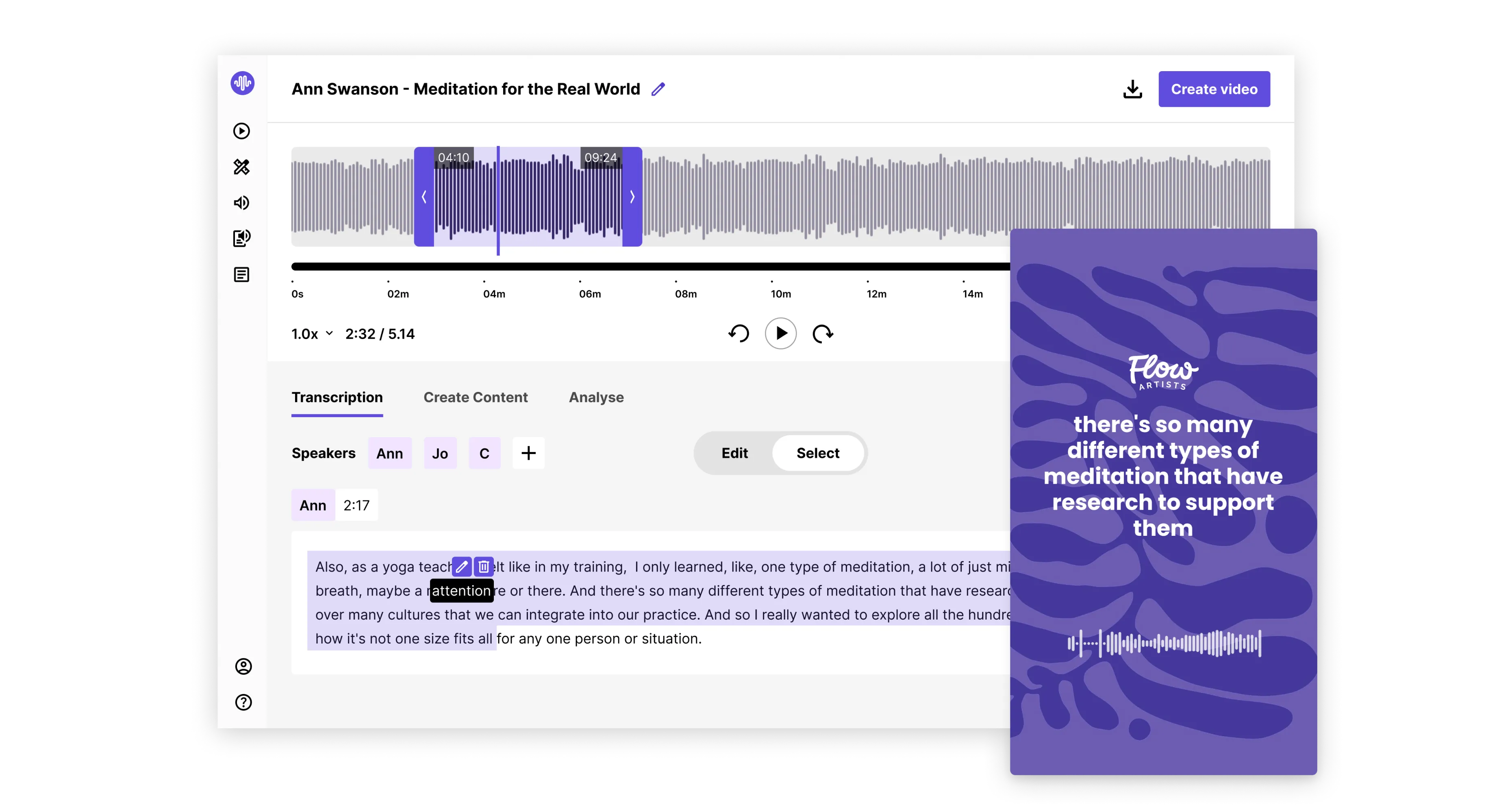
SoundMadeSeen is an AI-powered tool for audio creators who want to transform their content into shareable video and text. The initial prototype was built by a solo developer without the help of design and ux. With the goal of scaling up the product needed a professional UI and considered user experience on a small budget.
Client
SoundMadeSeen
Contributions
UX design, UI design
Year
2024 - Current
Sound Made Seen
Refining an AI-powered tool for audio creators
UX/UI Consulting • SaaS • Lean Startup

SoundMadeSeen is an AI-powered tool for audio creators who want to transform their content into shareable video and text. The initial prototype was built by a solo developer without the help of design and ux. With the goal of scaling up the product needed a professional UI and considered user experience on a small budget.
Client
SoundMadeSeen
Contributions
UX design, UI design
Year
2024 - Current
Sound Made Seen
Refining an AI-powered tool for audio creators
UX/UI Consulting • SaaS • Lean Startup

SoundMadeSeen is an AI-powered tool for audio creators who want to transform their content into shareable video and text. The initial prototype was built by a solo developer without the help of design and ux. With the goal of scaling up the product needed a professional UI and considered user experience on a small budget.
Client
SoundMadeSeen
Contributions
UX design, UI design
Year
2024 - Current
Sound Made Seen
Refining an AI-powered tool for audio creators
UX/UI Consulting • SaaS • Lean Startup
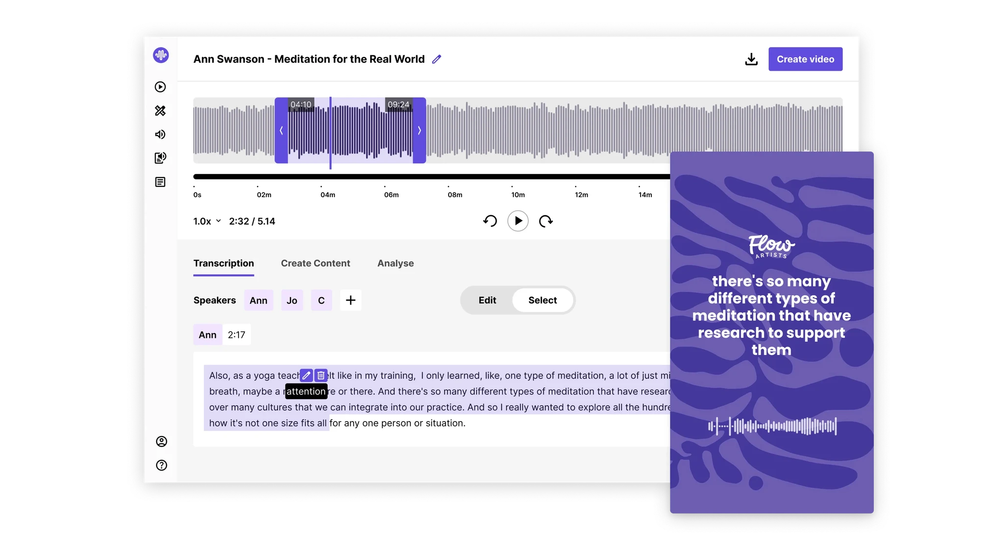
SoundMadeSeen is an AI-powered tool for audio creators who want to transform their content into shareable video and text. The initial prototype was built by a solo developer without the help of design and ux. With the goal of scaling up the product needed a professional UI and considered user experience on a small budget.
Client
SoundMadeSeen
Contributions
UX design, UI design
Year
2024 - Current



Our Approach
Establish a better baseline
With a solid technical foundation but no prior product design involvement, there were clear areas for improvement. Our goal was to bring the product to a stronger baseline by addressing the biggest pain points and most-requested features. Through user feedback and observation, we prioritised high-impact changes that required minimal effort, working efficiently within the constraints of a small budget and team of just a developer and designer.
Overline
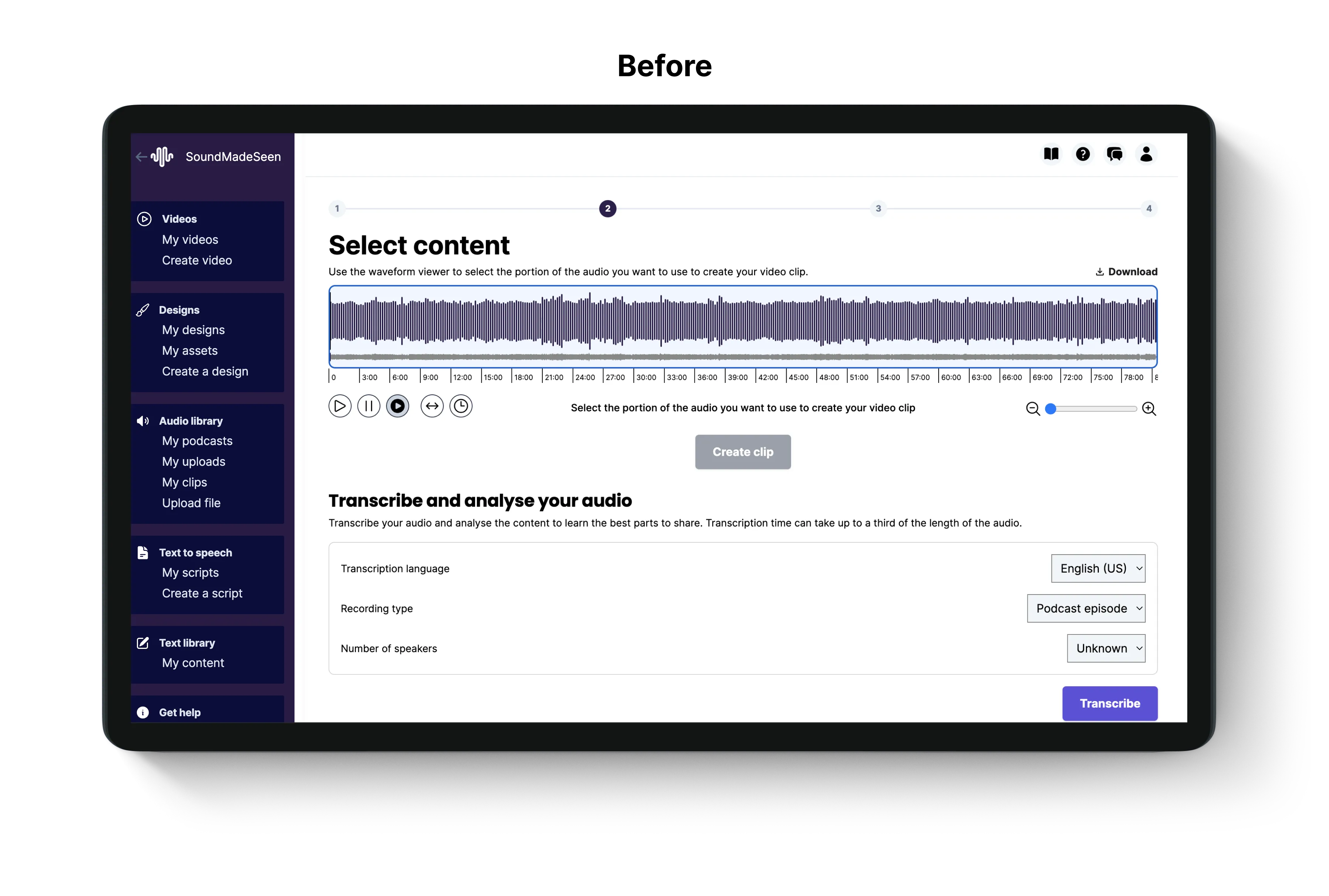
Creating a design framework that enabled the founder to keep building with style
I created a simple design system to quickly elevate the site’s design to a more polished standard. The system included components and styles that the developer, Rane, could implement independently, reducing the need for ongoing design input. This initial design system was a rapid, impactful update, designed with the flexibility to expand and refine over time as new features were added.

a new journey
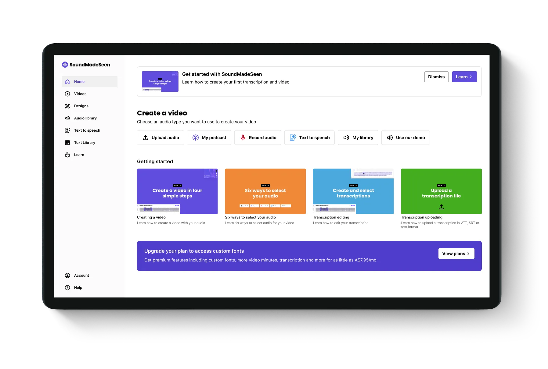
Streamlining the process
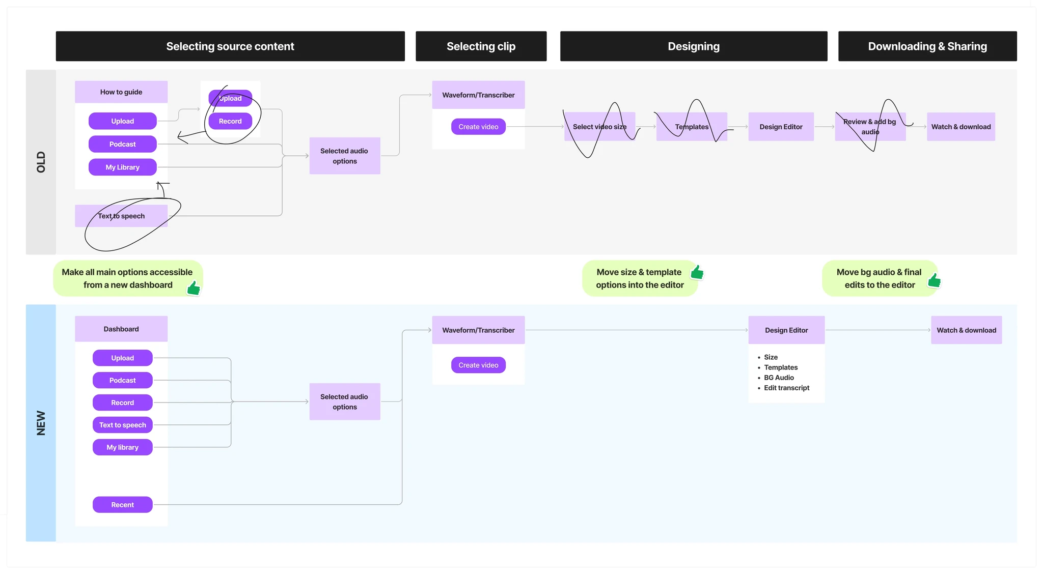
By analysing the 'create a video' flow, I identified some unnecessary steps that could be consolidated and simplify the user experience. I also improved the starting screen by introducing a dashboard that displays all options and recent files for easier access.


Dashboard
Guiding new users
I designed a central starting point that adapts to each user’s journey. For new users, getting started guides are available right on the dashboard, helping them onboard smoothly from the moment they sign up.
Dashboard
Guiding new users
I designed a central starting point that adapts to each user’s journey. For new users, getting started guides are available right on the dashboard, helping them onboard smoothly from the moment they sign up.
Dashboard
Guiding new users
I designed a central starting point that adapts to each user’s journey. For new users, getting started guides are available right on the dashboard, helping them onboard smoothly from the moment they sign up.


Dashboard
Quick access for established users
For returning users, the dashboard now prioritises their most recent content, offering instant access to synced podcast episodes or uploaded audio, streamlining their workflow.
Dashboard
Quick access for established users
For returning users, the dashboard now prioritises their most recent content, offering instant access to synced podcast episodes or uploaded audio, streamlining their workflow.
Dashboard
Quick access for established users
For returning users, the dashboard now prioritises their most recent content, offering instant access to synced podcast episodes or uploaded audio, streamlining their workflow.
Transcription editor
Streamlined usability and new features
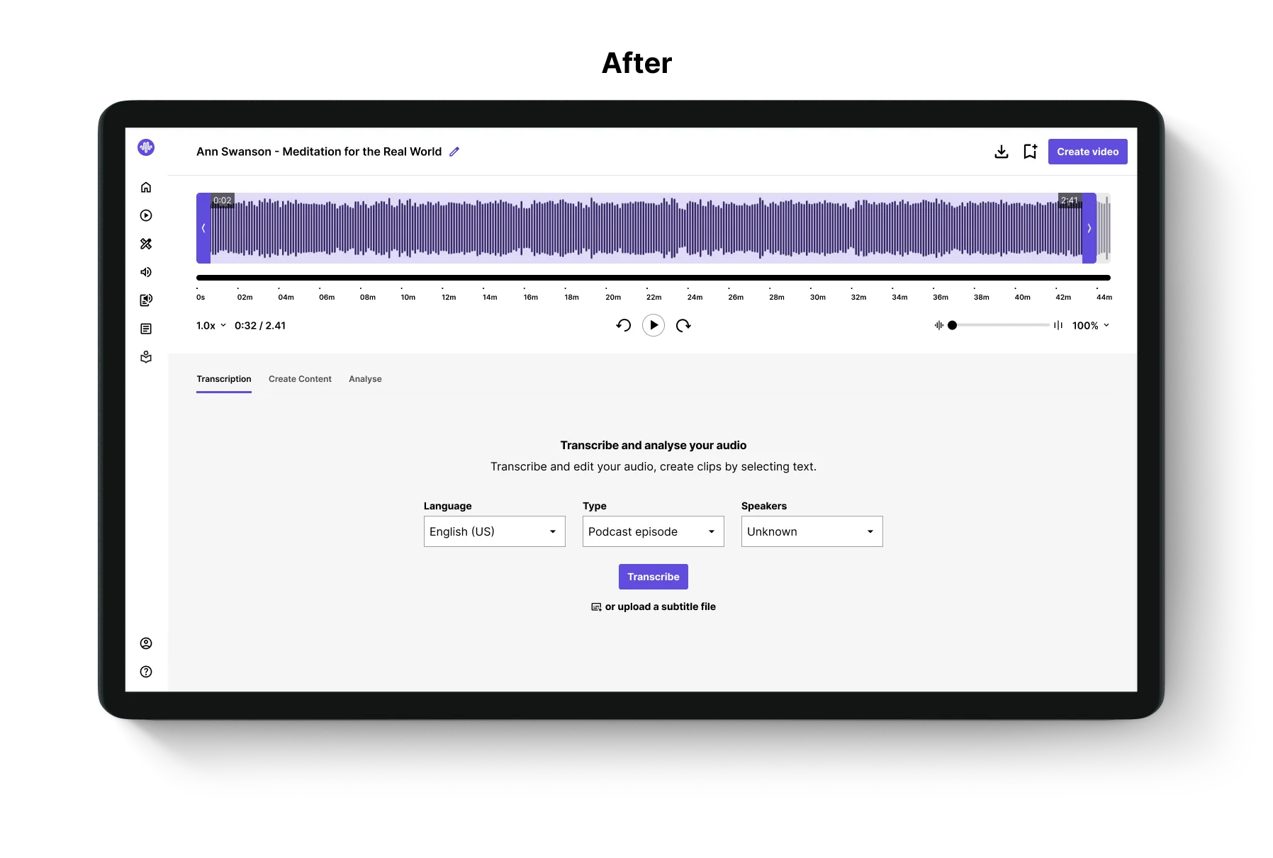
One of our top priorities was improving the transcription editor, which users found challenging to navigate. I redesigned the UI for clarity and ease of use, while Rane enhanced the technical functionality to create a smoother, more intuitive experience.
Design editor
Making design easier for beginners
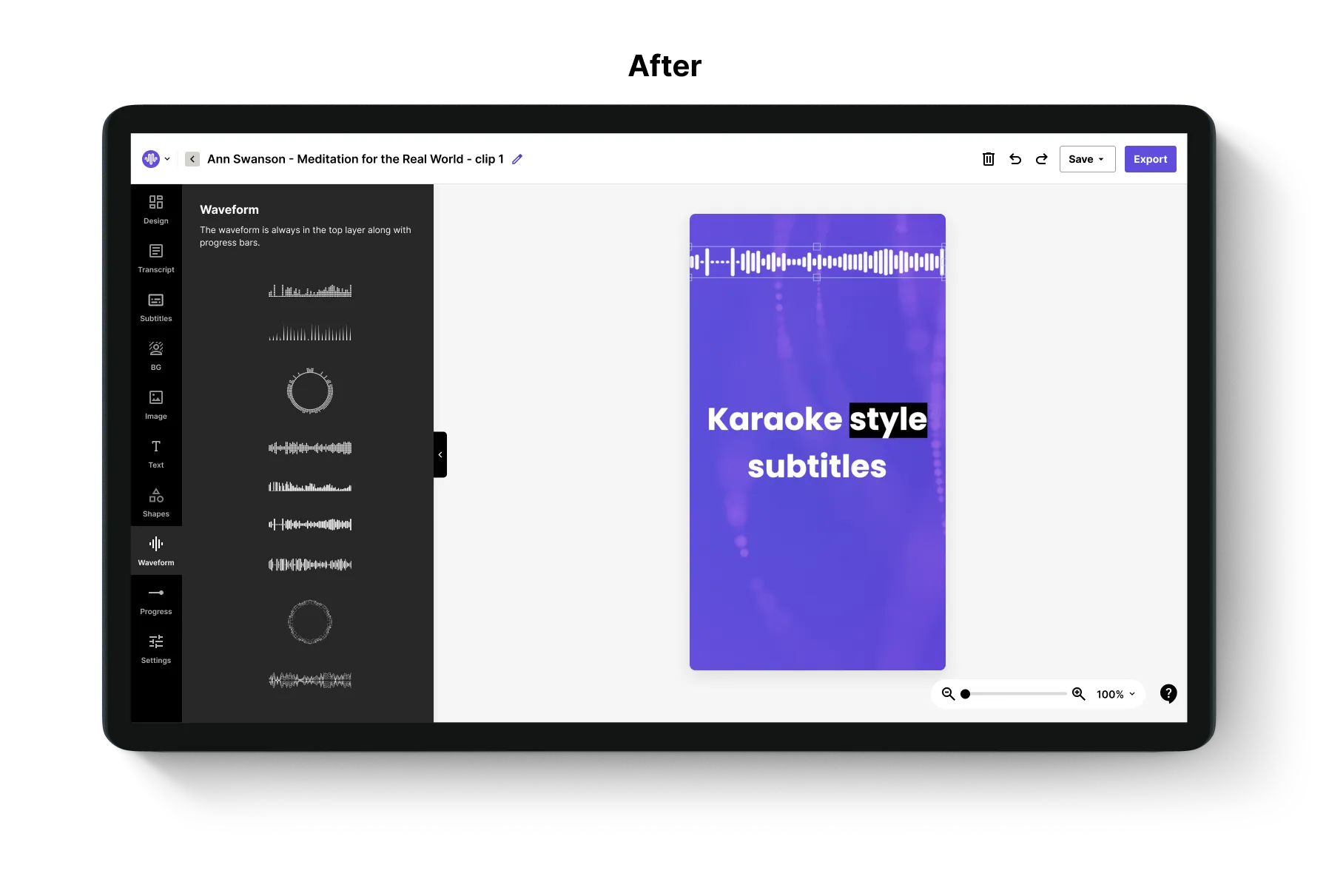
After selecting an audio clip users proceed to the design editor to style their video with backgrounds, shapes and captions generated from the transcription. We've been progressively updating the design editor starting with a more efficient layout and adding more features with more iterations to come.


Homepage
Making a better first impression
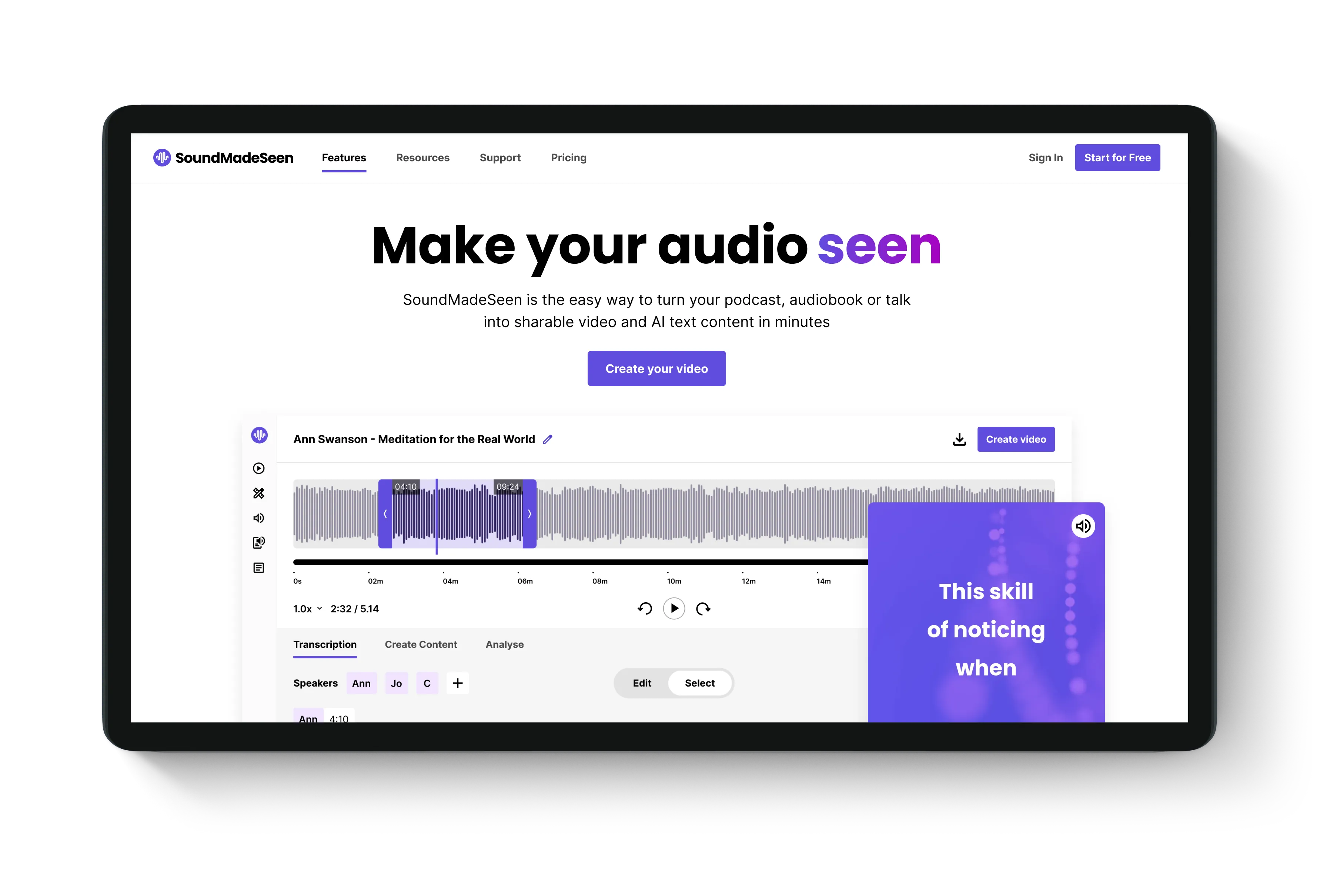
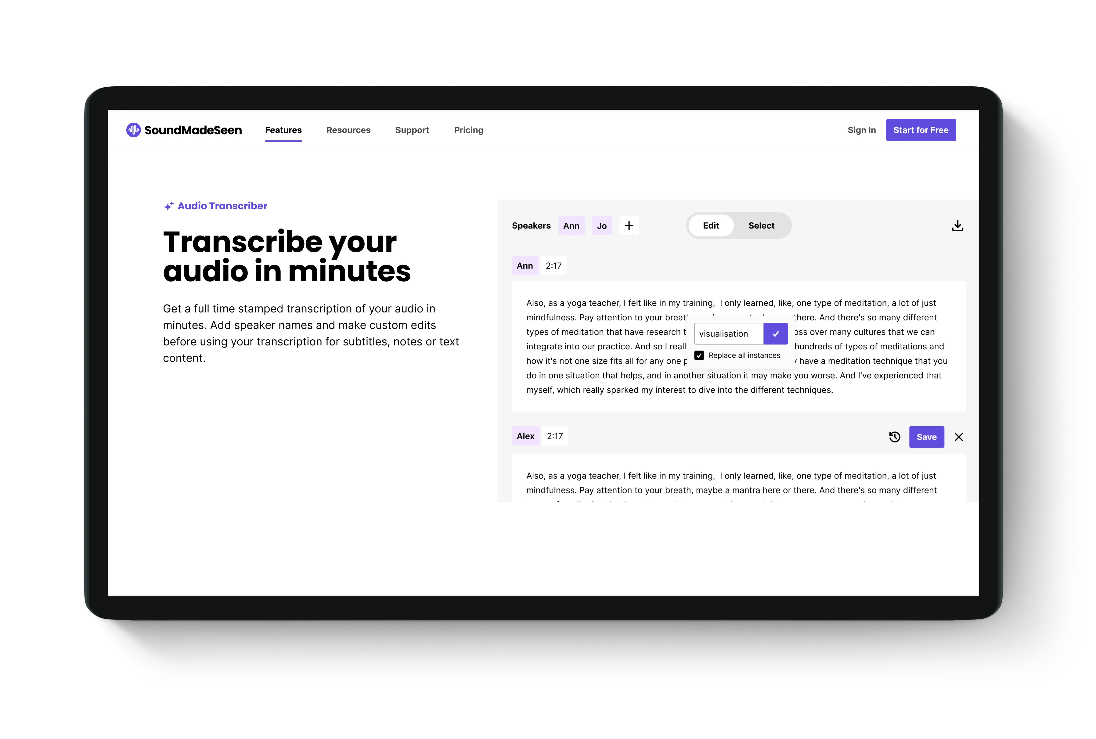
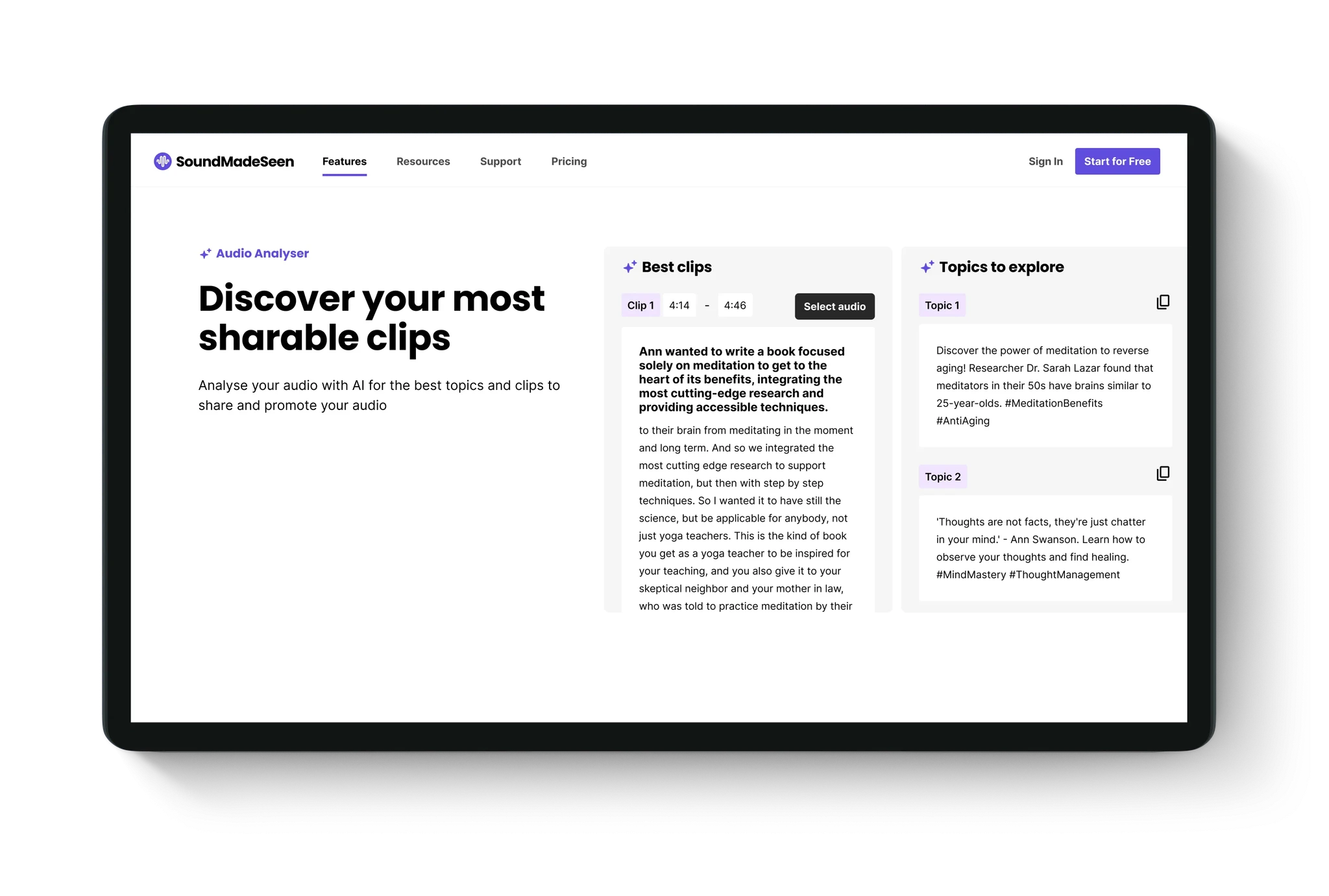
After upgrading the product we needed a better way to showcase the features and benefits to potential users on the homepage. I updated the homepage design to our new brand style and refreshed the content, images and copy to highlight how all the tools could help users in their workflow.


What's Next
Onwards and upwards
The journey of bringing SoundMadeSeen to it's current stage has been about setting a solid foundation, prioritising key feature improvements and enhancing the usability and design within the constraints of limited resources. We've got more to do to reach to it's final vision but now we're at a better baseline to make that happen.
Overline
Creating a design framework that enabled the founder to keep building with style
I created a simple design system to quickly elevate the site’s design to a more polished standard. The system included components and styles that the developer, Rane, could implement independently, reducing the need for ongoing design input. This initial design system was a rapid, impactful update, designed with the flexibility to expand and refine over time as new features were added.

a new journey
Streamlining the process
By analysing the 'create a video' flow, I identified some unnecessary steps that could be consolidated and simplify the user experience. I also improved the starting screen by introducing a dashboard that displays all options and recent files for easier access.

Dashboard
Guiding new users
I designed a central starting point that adapts to each user’s journey. For new users, getting started guides are available right on the dashboard, helping them onboard smoothly from the moment they sign up.


Dashboard
Quick access for established users
For returning users, the dashboard now prioritises their most recent content, offering instant access to synced podcast episodes or uploaded audio, streamlining their workflow.
Transcription editor
Streamlined usability and new features
One of our top priorities was improving the transcription editor, which users found challenging to navigate. I redesigned the UI for clarity and ease of use, while Rane enhanced the technical functionality to create a smoother, more intuitive experience.
Design editor
Making design easier for beginners
After selecting an audio clip users proceed to the design editor to style their video with backgrounds, shapes and captions generated from the transcription. We've been progressively updating the design editor starting with a more efficient layout and adding more features with more iterations to come.


Homepage
Making a better first impression
After upgrading the product we needed a better way to showcase the features and benefits to potential users on the homepage. I updated the homepage design to our new brand style and refreshed the content, images and copy to highlight how all the tools could help users in their workflow.


What's Next
Onwards and upwards
The journey of bringing SoundMadeSeen to it's current stage has been about setting a solid foundation, prioritising key feature improvements and enhancing the usability and design within the constraints of limited resources. We've got more to do to reach to it's final vision but now we're at a better baseline to make that happen.
More Case Studies
More Case Studies
More Case Studies
More Case Studies
Let's collaborate.
Kelly Stubbs © 2025
I acknowledge the Wurundjeri people as the Traditional Owners of the Kulin Nation on which I live, work and create.
Let's collaborate.
Kelly Stubbs © 2025
I acknowledge the Wurundjeri people as the Traditional Owners of the Kulin Nation on which I live, work and create.
Let's collaborate.
Kelly Stubbs © 2025
I acknowledge the Wurundjeri people as the Traditional Owners of the Kulin Nation on which I live, work and create.
Let's collaborate.
Kelly Stubbs © 2025
I acknowledge the Wurundjeri people as the Traditional Owners of the Kulin Nation on which I live, work and create.
